For the second devblog, I want to talk about something extremely glamorous, deeply mystical, and absolutely guaranteed to make every game developer question their life choices: UI.
Specifically, the first pass at the main menu and duel interface for Absolute Territory: Duels of the Gods.
When players arrive at the main menu, I didn’t want them staring at a generic list of buttons. That would work, technically, but so would eating cereal with a fork. Instead, the current menu presents each major option as a card.
And because this is a card game, naturally, the cards flip.
When the player moves their mouse over one of the menu cards, it flips over to reveal the option underneath. It’s a small touch, but I really wanted even the most basic interactions to feel like they belong inside the world of the game. You are not clicking through a spreadsheet. You are a deity preparing to command followers, open packs, build decks, and cause problems on purpose.
The current menu is still early, of course. The layout, timing, polish, effects, and final options may all change as development continues. But this was an important step in establishing the basic feel of the game: clean, readable, card-focused, and just dramatic enough to remind you that the gods are involved.
Now for the bigger reveal.
For the first time, I’m also showing a screenshot of the pre-alpha duel scene.
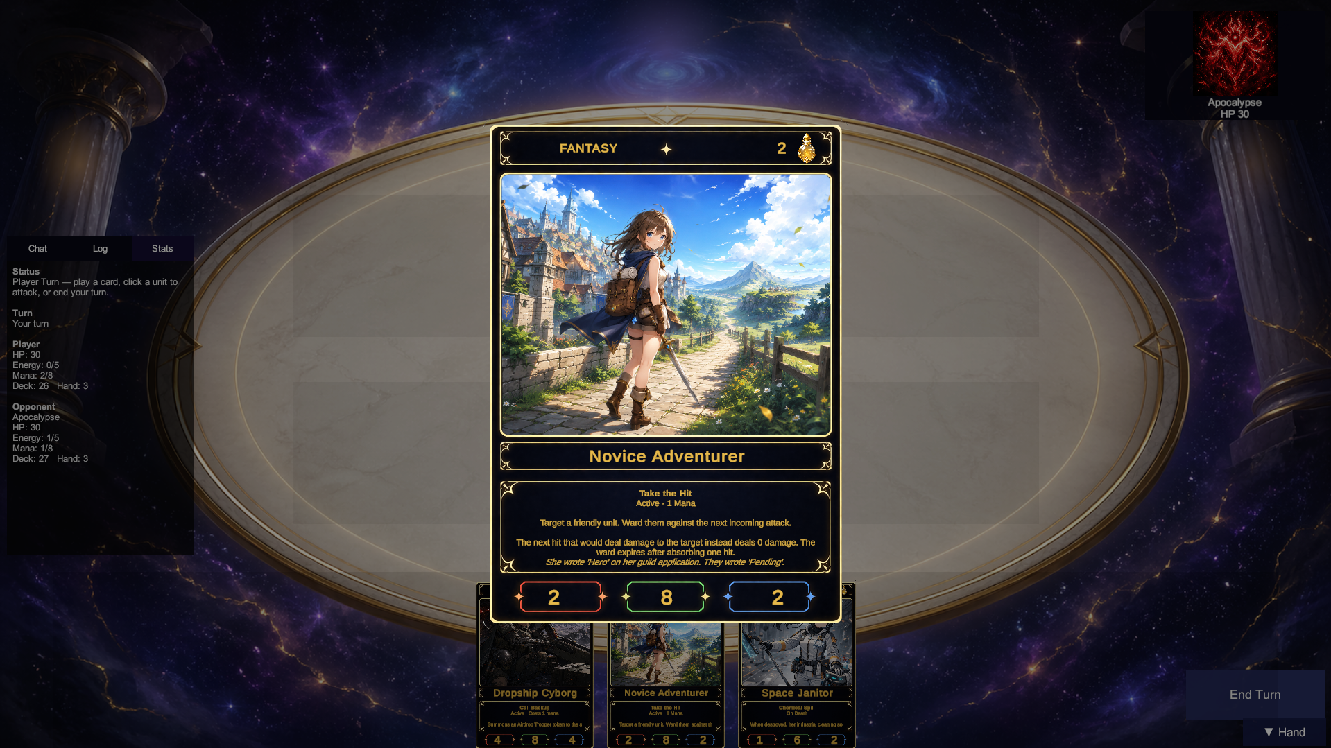
This is still very early, so please imagine a large glowing “WORK IN PROGRESS” sign hovering over the entire battlefield. The duel UI is not final, the layout is not final, the effects are not final, and I reserve the sacred developer right to move everything around seventeen more times.
That said, this is the first real look at how duels are currently presented in-game.
The screenshot shows a duel in progress, with the player’s hand at the bottom and a zoomed-in card preview in the center. Since Absolute Territory is a card battler first, card readability is one of the most important parts of the interface. Players need to be able to quickly inspect a card’s cost, stats, abilities, and flavor text without needing divine intervention or a magnifying glass.
The current duel scene includes the battlefield, player hand, opponent display, basic status information, a log/chat panel, and turn controls. Some of it is placeholder. Some of it is functional but ugly. Some of it is sitting there politely waiting for better art. Such is the pre-alpha life.
But the core idea is already visible: the card should be the star.
Zooming in on cards from the hand helps make each unit feel more physical and readable during play. This will become even more important as effects, targeting, status conditions, animations, and PvP presentation continue to develop.
I also wanted the battlefield itself to have room to breathe. The current board is intentionally spacious because future versions need to support clearer unit placement, targeting indicators, combat feedback, match events, and all the other little things that turn “the code says this happened” into “yes, I felt that.”
I’m also including a small behind-the-scenes screenshot showing the basic composition of a card in code.
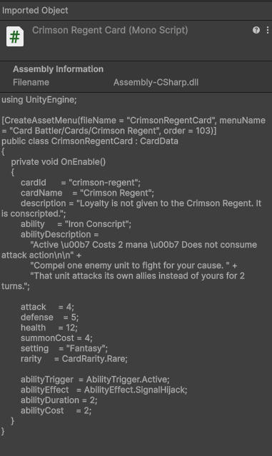
This example is Crimson Regent, who I’ll say more about another time. For now, the important part is that cards in Absolute Territory are not just images with numbers placed on top. Each card has its own data: name, description, setting, rarity, attack, defense, health, summon cost, ability trigger, ability effect, ability duration, and ability cost.
In other words, the pretty card you see in-game is backed by actual rules the server and client can understand.
That structure is what lets a card like Crimson Regent become more than artwork. Her effect, stats, cost, and behavior can all be defined in a consistent way, then used by the duel system during play. It also makes it much easier to build, test, balance, and expand the card pool without every new card becoming a tiny personal crisis. Or at least, without every new card becoming a large personal crisis.
Behind the scenes, the duel screen is already connected to real game systems rather than being just a mockup. The UI shown here is part of the next big step: making those systems feel like an actual game.
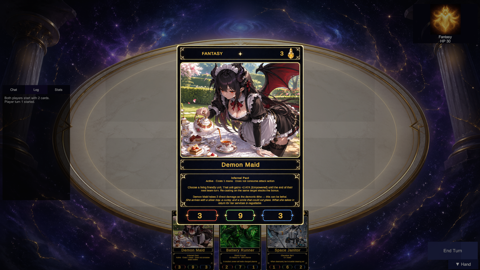
There’s still a lot to do. The duel interface needs cleaner panels, better visual hierarchy, stronger animations, improved effects, and a more polished overall flow. Cards need better indicators as to what each stat is beyond the tutorial so players can jump right in. The main menu will also keep evolving as the presentation gets closer to release quality.
But for now, this is a milestone I’m happy to share.
More to come!